We tend to choose paint by what looks good in the store and forget that we'll be living inside the color for years. Hue is one of the most constant environmental signals we receive, and it works below conscious thought. You won't consciously think "this room is agitating me," but a too-saturated red or a cold, gray-blue can keep the body a little on edge without your ever naming why.
What the research actually supports
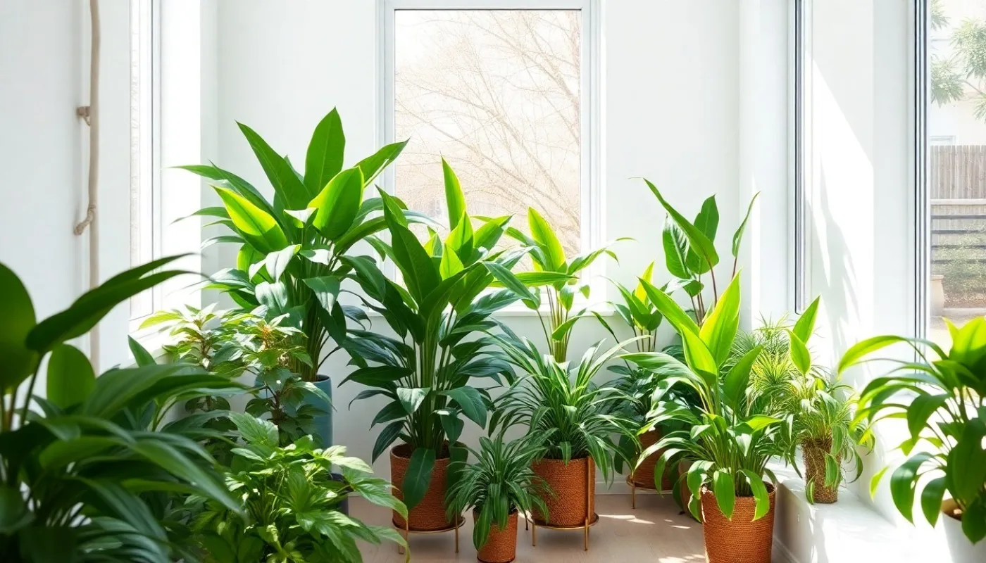
I want to be careful here, because color psychology attracts a lot of overstatement. The honest version: culture and personal association shape a great deal of how we read color, so there are no universal laws. But some tendencies show up consistently. Softer, less saturated colors are generally experienced as calmer than vivid, high-chroma ones. Cooler tones — muted greens and blues — tend to read as restful and are common in bedrooms and therapy rooms for that reason. Warm neutrals and gentle earth tones read as grounding and safe.
- Soft green — balance, renewal, and a quiet nod to nature; easy on the eyes.
- Muted blue — associated with calm and lowered arousal; lovely for rest, can feel cold if too gray.
- Warm blush and terracotta — comforting and human, a gentle warmth without alarm.
- Sandy neutrals and clay — grounding; they let other things in the room breathe.
- Bright red and stark white — energizing or clinical; use as accents, not whole rooms.
Feng shui's five elements
Feng shui offers a framework that many people find easier than reading color charts: the five elements — wood, fire, earth, metal, and water — each carry associated colors and qualities. Greens and teals belong to wood (growth, vitality). Reds and oranges are fire (passion, energy — powerful in small doses). Yellows, browns, and clay are earth (stability, nourishment). Whites and grays are metal (clarity, precision). Deep blues and black are water (calm, reflection, flow).
The practice isn't about picking one; it's about balance. A room heavy in cool, watery blues can feel a touch melancholy until you warm it with an earth tone or a wood accent. You don't have to adopt the whole system to borrow its instinct: rooms feel best when no single quality dominates.
You're not decorating a room. You're choosing the emotional weather you'll live in.
How to choose without regret
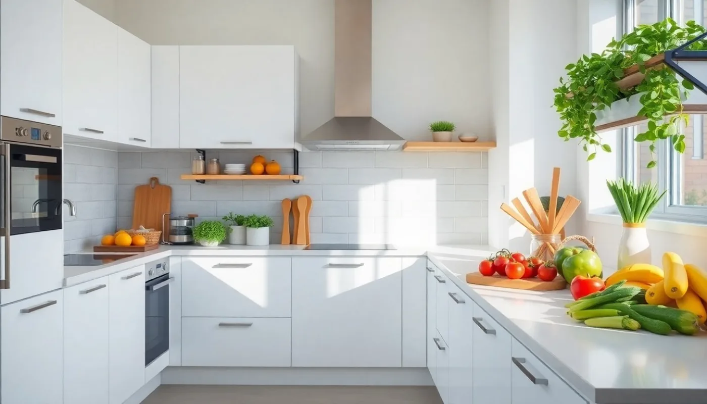
Match the color to what the room is for. Bedrooms and spaces for rest want soft, cool, or warm-neutral tones that lower the volume. A creative studio or a social kitchen can take more energy and warmth. And always test large samples on the actual wall, in your actual light, at the times of day you'll be in the room — north light, afternoon sun, and a lamp at night can make the same swatch feel like three different colors.
If a full repaint feels like too much, remember that textiles carry color too. A throw, cushions, a rug, or art can shift a room's emotional temperature in an afternoon. Start with what you can change easily, live with it, and let the room tell you what it needs next.
Robin Siebold, Ph.D., is a Licensed Mental Health Counselor offering holistic, whole-person counseling in Fern Park, Florida and by telehealth across the state. These reflections are for general wellbeing and are not a substitute for individual therapy or medical care.